If you’ve spent time on Twitter or in front of cable television in the last month, you’ve probably seen a lot of charts.
While they’re vital in visualizing the pandemic — how else can we grasp the spread of a virus approximately 100 nanometers wide? — charts aren’t impartial. They have assumptions; they leave things out. And when they’re deployed to make rhetorical points, it can be devilishly difficult to find the lie.
Here are three things I look for when a new chart flashes across my Twitter feed:
1. Does the unit of measurement make sense? Bad news can easily be made to look good, if you don’t actually show the bad news.
A few weeks back, the administration deployed this positive-looking chart to show how well testing was going in the U.S. Generally, charts that show an up-and-to-the-left trend mean good stuff is happening. But sharp-eyed chart-readers noted the graphic showed the growth in cumulative tests conducted — not an increase in the number of daily tests, the more important metric. That trend was much more grim, as redrawn charts showed.
2. Has anyone monkeyed around with the scale? A common trick used to exaggerate — or minimize — a trend is to play around with y-axis. Take a look at this polling chart below:
Wow, looks like Candidate B is way ahead! Not really — the chart starts a number other than zero, exaggerating the gap. If the numbers on the left side of the chart look funky, beware.
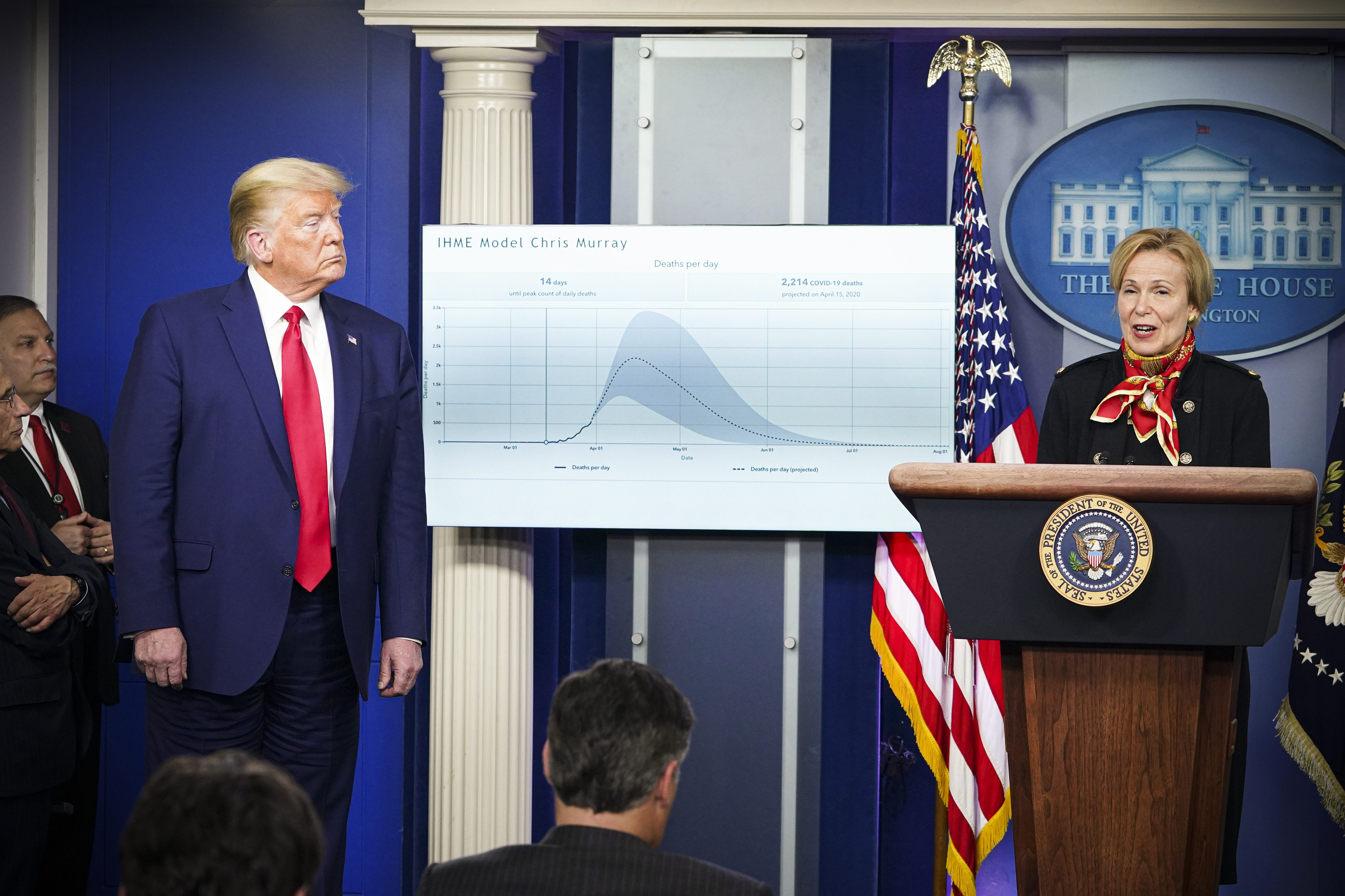
3. Does the chart acknowledge uncertainty?
No one truly knows what’s going on. This is as true for coronavirus projections as it is for political polling, or even the fluctuations of the oil market. Good charts acknowledge this by showing uncertainty zones, or prominently displaying margins of error. Bad charts hide this stuff, and pretend to be all-knowing.
Charts help us understand this crisis. We just need to make sure we’re understanding it correctly.